I also worked much more on making everything look professional, so hopefully that paid off...!

For the humanoid model, I wanted to keep the overall teenager-y shape of the body, instead starting to take it in different thematic directions. The first introduces runes and "fire" coming off of joints, which would be further worked on with a fiery "mane" next week. The second begins to incorporate decorative elements which would be further expounded on.

For the more bestial model, I took one in the direction of being a little more wild, with fur tufts that could perhaps be colored bright red and maybe even animated with a wavering animation. The second is much more decorative, like above, giving him some interesting inorganic-yet-organic pieces to play with in the future.
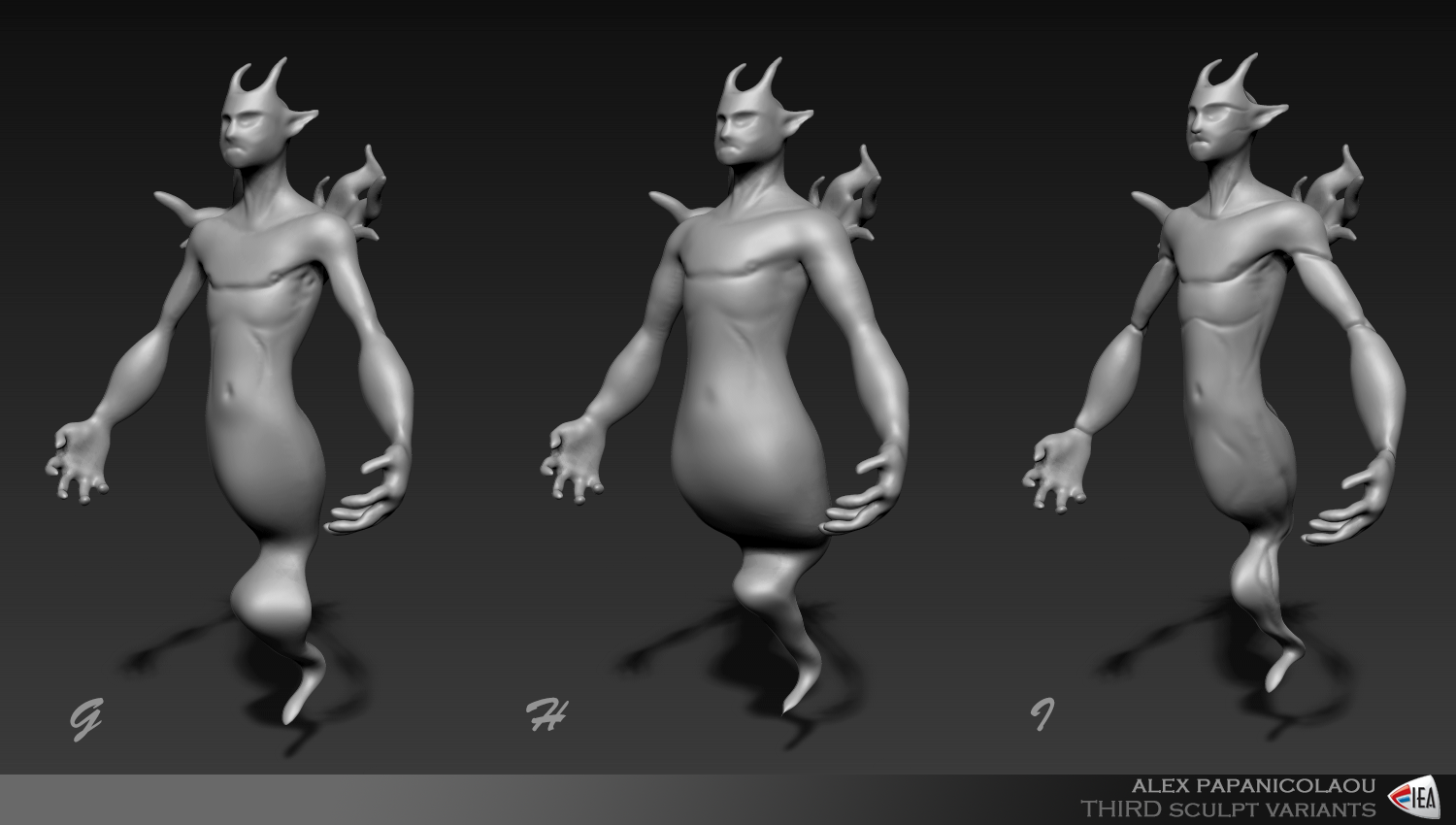
For the more spirit-like model, I played around with proportions more than adding decoration and detail. The first mimics the humanoid model, though the second a little more portly while the third is more angular and forward-leaning, with some rakes to make him seem more wispy.

Here's the sculpt that I started from scratch on. Admittedly a little simple, but I wanted to go for a much more stylized ghost-type character with a form that focused less on anatomy. I also had more fun with the head variations with different animals.
And here's all of them lined up all pretty in a row!

I look forward to further developing these next week.
Very nice layout. lets put that at the top next time. Lets reduce the size of the fonts a bit. I really like the shapes you are starting to hit, but I think you can push the quality of and variation of your sculpts a bit more. The work is looking really nice so far. Give me some eyes on your characters, and paint in the glow in Photoshop on another layer.
ReplyDelete